Two-tone kitchen cabinets use two different cabinet colors or finishes in the same kitchen, most often with lighter upper cabinets paired with deeper-toned lowers, or a contrasting island set against neutral perimeter cabinetry. It is one of the fastest-growing design strategies in residential kitchens this year.
According to the 2026 U.S. Houzz Kitchen Trends Study (n=1,780 renovating homeowners), nearly 1 in 4 households are now choosing contrasting colors for their upper and lower cabinets, and wood-toned cabinetry has overtaken white as the most popular cabinet finish for the first time in nearly a decade. The shift signals a broader move away from the all-white minimalism of 2018 to 2023 toward what designers in the 2026 NKBA Design Trends Report call “layered, intentional, and personal” kitchens.
If you’re remodeling in 2026, two-tone is no longer an unusual choice. It is one of the dominant directions in current trend data. The risk isn’t whether to do it; it’s how to execute it without aging the kitchen fast.
This guide walks through the four layout strategies designers most commonly recommend, the color pairings holding up across 2026 trend reports, the proportion and undertone rules that prevent the look from feeling chaotic, and the mistakes that date a two-tone kitchen the fastest. Throughout, you’ll see how Fabuwood’s door styles and finish library map onto these decisions, because IST stocks Fabuwood and the planning conversation usually starts there.
Two-Tone Kitchens in 2026
Sourced from Houzz 2026 Kitchen Trends Study (n=1,780), NKBA 2026 Design Trends Report, and MasterBrand 2026 Designer Panel.
~1 in 4 Choose Contrasting Cabinets Of 2026 renovating homeowners, nearly a quarter chose different colors for upper and lower cabinets. | 29% > 28% Wood Overtakes White First time in years. Wood-toned cabinets edged past white as the #1 finish in 2026. |
40% Pick White for Upper Cabinets When going two-tone, 40% of homeowners pick white uppers, 19% off-white, 17% wood tones. | 86% Designers Predict Green Leads 86% of NKBA-surveyed designers expect green to lead 2026 kitchen color palettes. Blue follows at 78%. |
+15% More Color on Perimeter Cabinets MasterBrand designers report a 15% YoY increase in hue on perimeter cabinetry. White moves to a supporting role. | 5–10% Two-Tone Cost Upcharge Typical Fabuwood upcharge over a single-tone order of the same size. Roughly $400–$1,200 on a $20K cabinet job. |
| Wood tones | 29% | |
| White | 28% | |
| Off-white | 15% | |
| Green | 6% | |
| Gray | 5% |
The 2026 Data Picture at a Glance
A handful of numbers anchor the rest of this guide. They come from three primary sources, which is unusual: trend reports from Houzz, NKBA, and the design community don’t typically agree, but they converged in 2026.
| Source | Finding | Sample size |
|---|---|---|
| 2026 Houzz Kitchen Trends Study | Nearly 1 in 4 renovating homeowners choose contrasting upper and lower cabinets | n=1,780 homeowners |
| 2026 Houzz Kitchen Trends Study | Wood-toned cabinets (29%) overtook white (28%) as the #1 finish for the first time in years | n=1,780 homeowners |
| 2026 NKBA Design Trends Report | 86% of designers expect green to lead 2026 palettes; 78% identify blue as a leading accent | n=634 design professionals |
| MasterBrand 2026 Designer Panel (reported in Sweeten) | 15% year-over-year increase in hue on perimeter cabinetry | designer panel |
| KBIS 2026 show floor analysis (300+ images, 60+ brands) | Black + Light Wood is the most common observed two-tone pairing at 18.80% of combinations | manufacturer show floor |
Three takeaways:
The center of gravity has shifted from “white kitchen with an accent” to “color-forward kitchen with white playing a supporting role.” White isn’t disappearing (28% is still substantial), but it no longer carries the whole room.
The colors winning the design awards aren’t loud. They’re grounded. The 2026 Colors of the Year from major paint companies sit in the same family: a balanced khaki neutral, smoky jade green, espresso brown, and indigo-leaning navy. That convergence reflects what NKBA’s panel calls “biophilic warmth”: colors that feel connected to natural materials rather than imported from a fashion mood board.
Two-tone in 2026 is less about contrast and more about composition.
The Four Layout Strategies Designers Use
Two-tone is best understood as a layout strategy rather than a paint job. In 2026 trend reports, four configurations show up consistently.
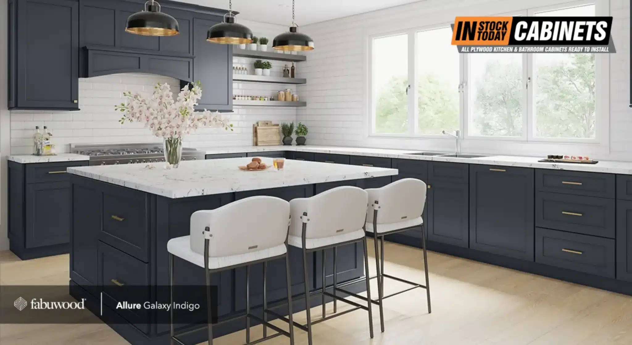
1. The classic upper/lower split (also called the “Tuxedo” layout)
Light cabinets above, deeper hues below. This is the most familiar and still the most common, and it’s what Houzz’s contrasting-cabinet data is mostly tracking. Of homeowners choosing this split, 40% pick white for the upper cabinets, 19% pick off-white, and 17% pick a wood tone. The lower cabinets are where the actual color decision happens. Wood, blue, green, and deep neutrals pull most of the votes.
Designers call this “Dark Below, Light Above,” and it works because it mirrors how the eye experiences gravity: heavier-looking colors on the bottom feel anchored, while lighter colors on top keep the ceiling feeling tall.
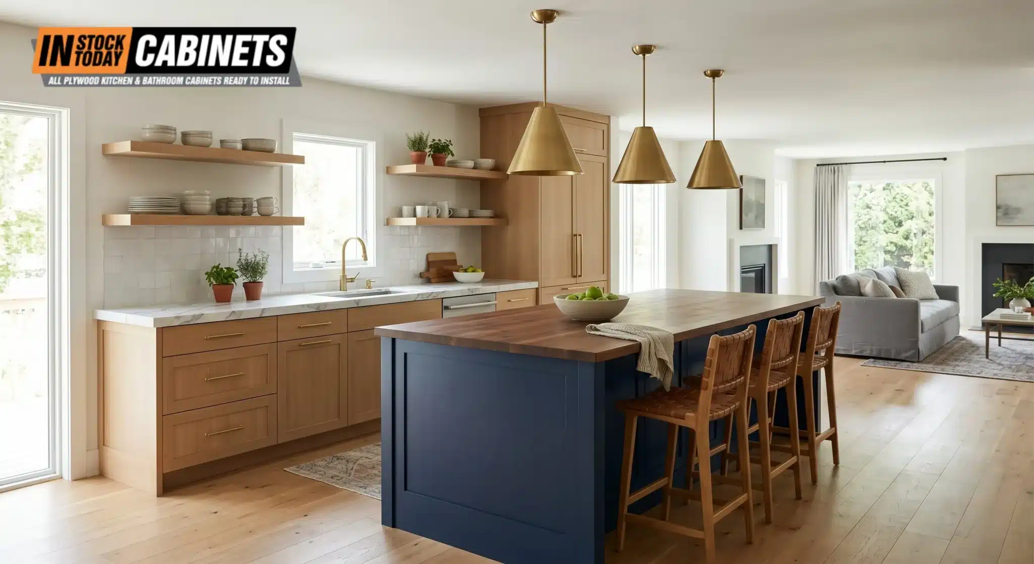
2. The island as a “Second Tone”
Perimeter cabinets stay in one tone (often a wood, off-white, or warm neutral), and the island becomes the accent piece. This is the layout designers reach for first when working with open-plan kitchens, since the island is already a visual focal point. The 2026 Houzz study reports that about half of renovated islands now exceed seven feet in length, which gives them enough physical presence to carry a bolder color without competing with the perimeter.
It also lets you go bolder with color, because a contrasting island reads as intentional rather than busy.
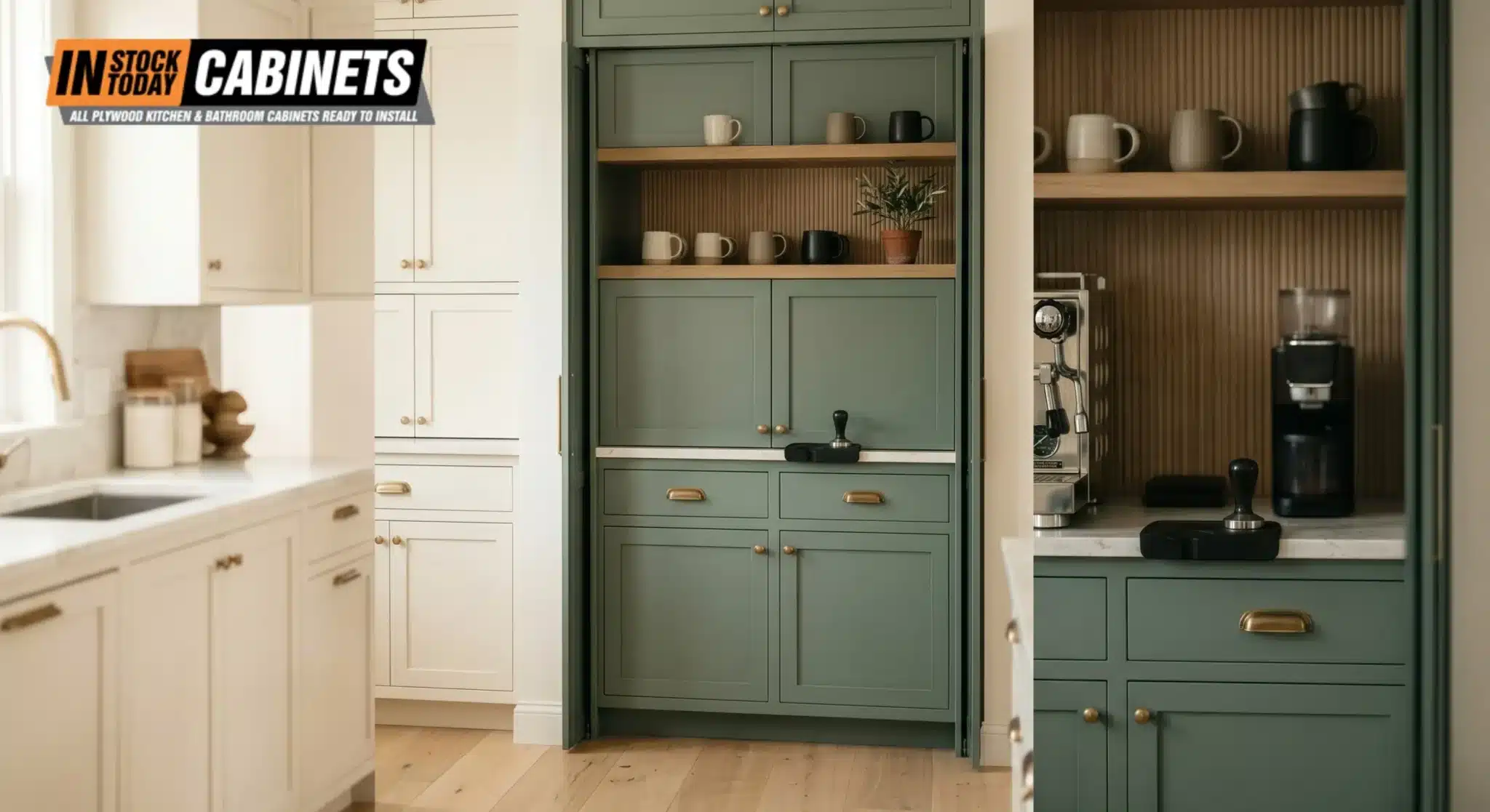
3. Vertical zoning (accent zones for specific functions)
A more nuanced 2026 approach: specific functional areas (a built-in pantry, a hood surround, a coffee bar, a butler’s pantry) are finished in a secondary color, while the rest of the kitchen stays uniform. This signals a move away from the “one-size-fits-all” kitchen toward purpose-driven zones.
According to the 2026 Houzz data, 24% of renovating homeowners now include a dedicated beverage station, and these are frequently used as the primary site for bolder color experimentation. It’s also the lowest-risk version of two-tone and the easiest to retrofit if you’re not gutting the kitchen.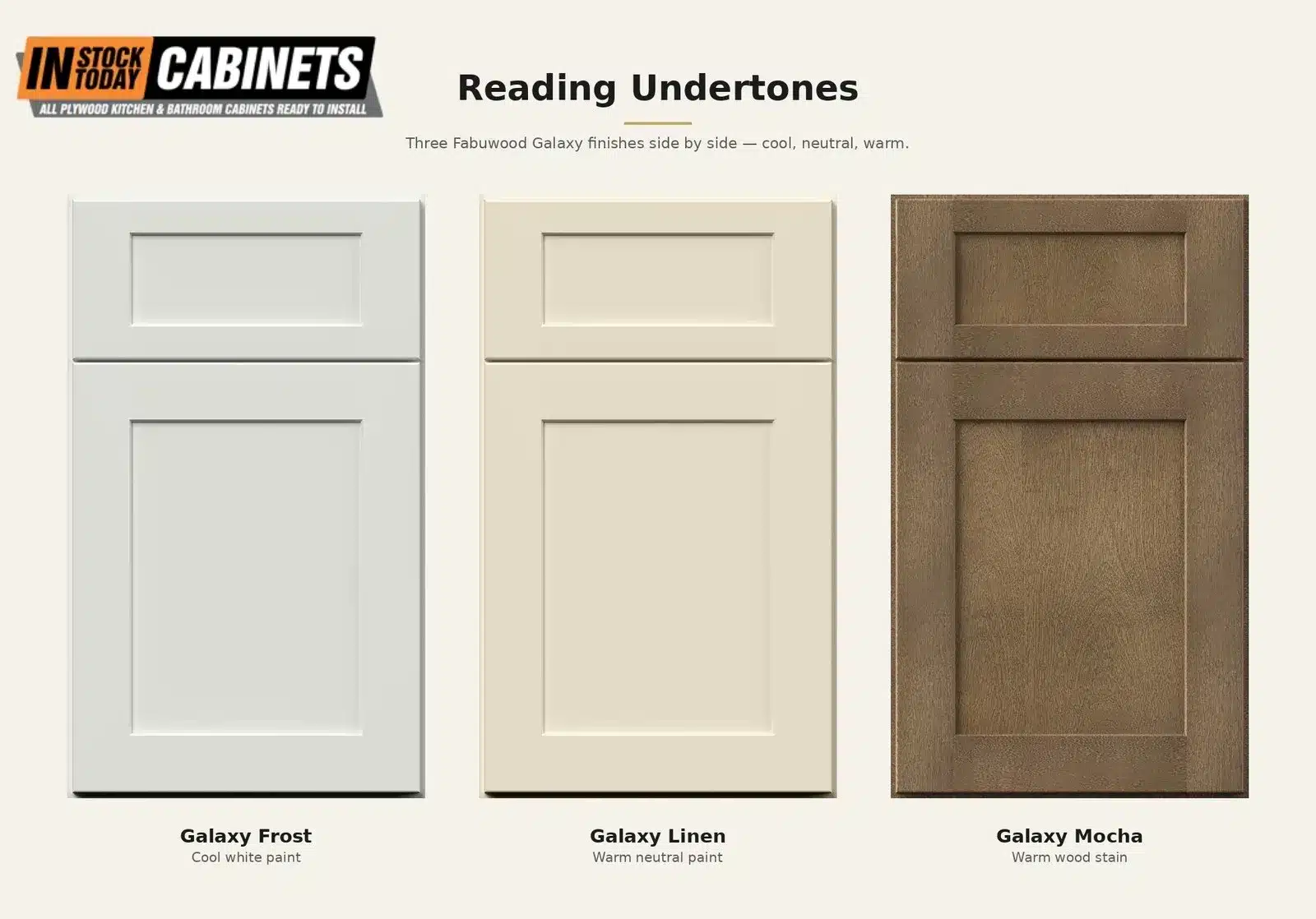
4. The monolithic tall-cabinet wall
To support what designers call “kitchen-living continuity,” many higher-end 2026 designs use floor-to-ceiling cabinetry to create a single architectural wall. These walls integrate pantry storage, coffee stations, and panel-ready appliances into one continuous surface. In a two-tone scheme, this wall is often finished in a deep, moody tone (charcoal, deep walnut, forest green) while the working island and perimeter stay lighter.
This is the most ambitious of the four layouts and works best in kitchens with at least 9-foot ceilings. It’s less common in standard 8-foot rooms because it can compress the space.
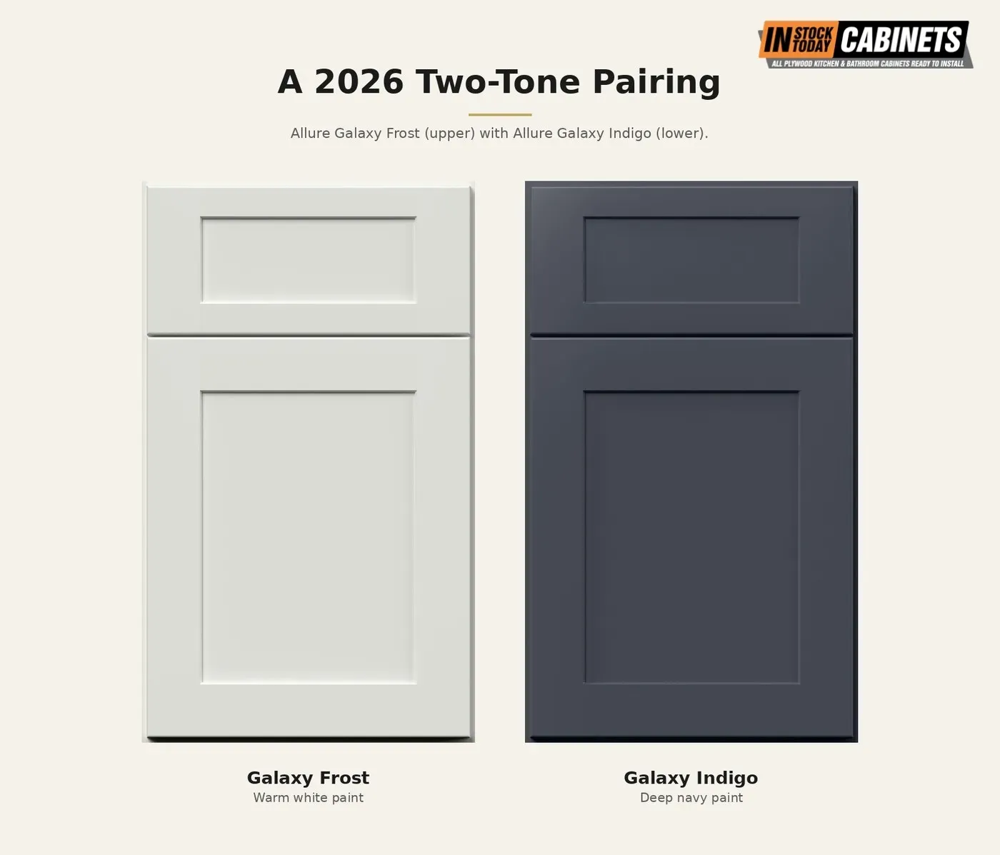
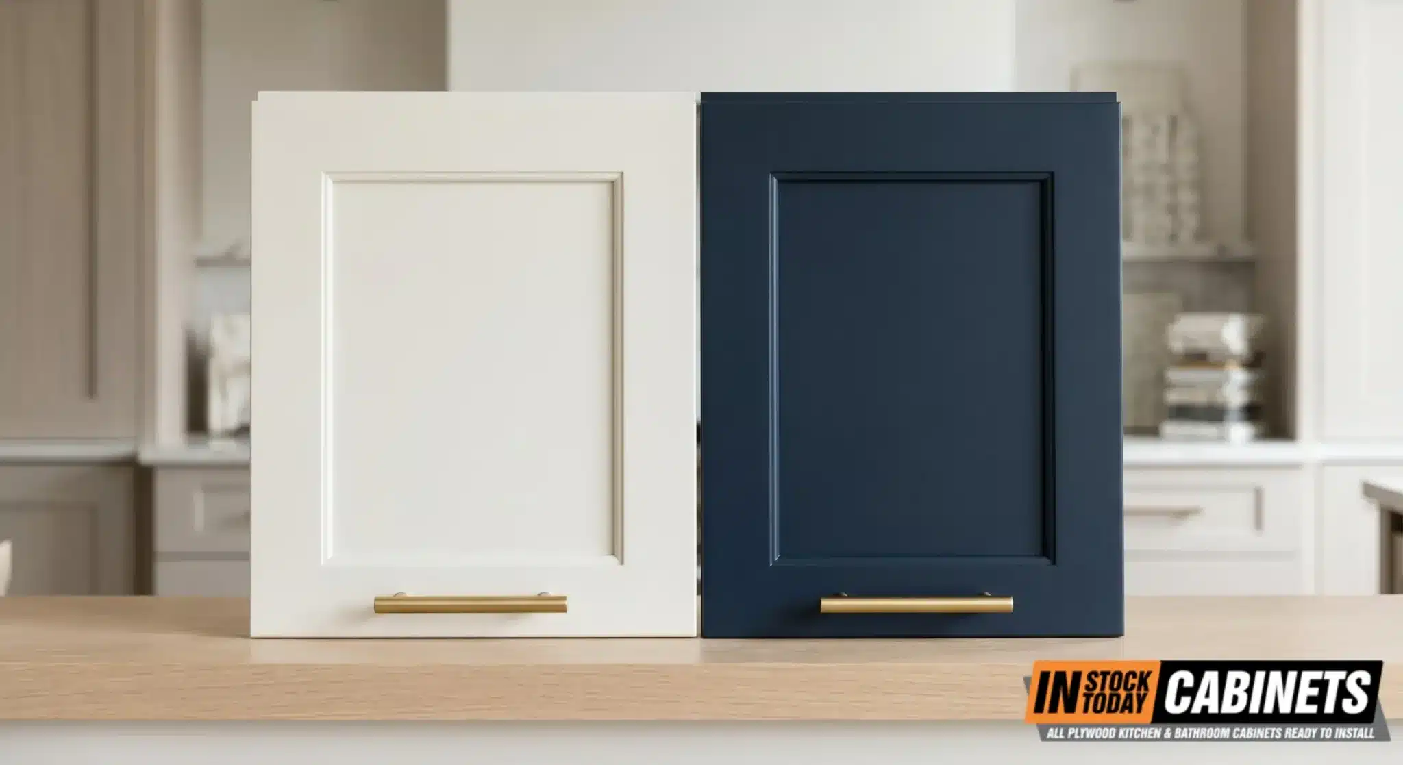
A note on door consistency across layouts: in any two-tone configuration, keeping a single cabinet door profile across both tones is essential. When the door style changes between upper and lower cabinets (Shaker upper, slab lower, for example), the kitchen reads as two separate cabinet runs rather than one intentional design. This is one reason Fabuwood works cleanly for two-tone. Door profiles like Galaxy and Allure stay consistent across their full color and finish range, so you can pair a Galaxy Frost upper with a Galaxy Indigo lower without any profile mismatch.
Color Pairings That Are Actually Working
The seven combinations below appear most often across 2026 trend reports, KBIS show floor analysis, and the conversations IST designers have with clients. Each includes specific paint codes where applicable (because “warm white” without a number can mean a hundred different things at the paint store) and a quick “Best for / Avoid if” note to flag practical fit.
Quick-Reference: 2026 Two-Tone Pairing Summary
| Pairing | Style | Resale-safe? | Lower / Island | Upper |
|---|---|---|---|---|
| Warm white + medium walnut | Transitional | Yes | Walnut, honey oak | SW Alabaster, BM White Dove |
| Cream/khaki + smoky jade green | Modern organic | Yes | BM Cushing Green, F&B Pigeon | SW Accessible Beige |
| Greige + walnut | Transitional | Yes | Walnut stain | BM Revere Pewter, SW Agreeable Gray |
| Off-white + deep indigo navy | Coastal/transitional | Yes | BM Hale Navy, SW Naval | BM Simply White |
| Dark wood upper + light maple lower | Contemporary | Caution | Light maple, rift oak | Espresso/dark walnut |
| Wood perimeter + bold island | Modern organic | Yes | Jade, navy, terracotta, forest green | Medium oak, walnut |
| Black upper + warm white lower | Statement contemporary | No | BM Simply White | SW Tricorn Black |
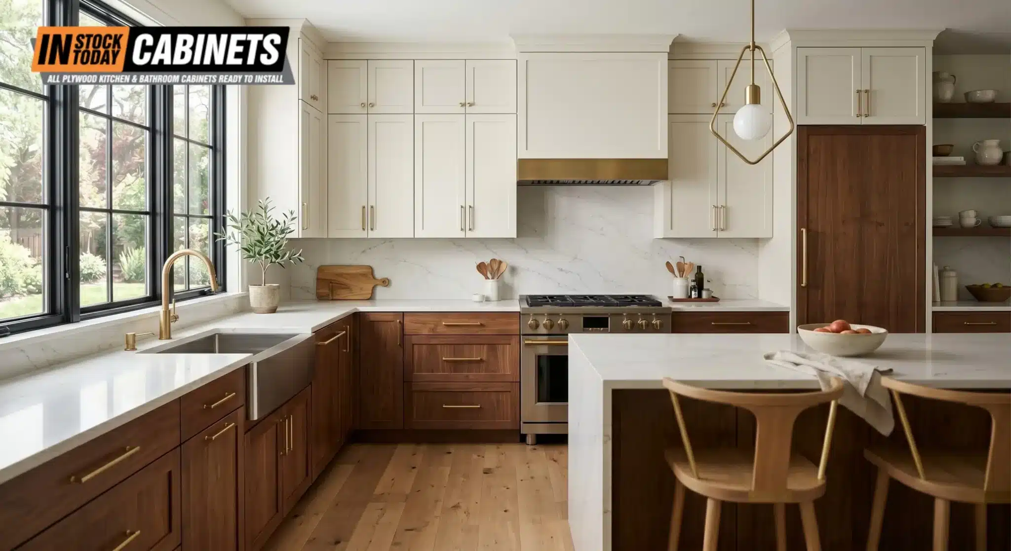
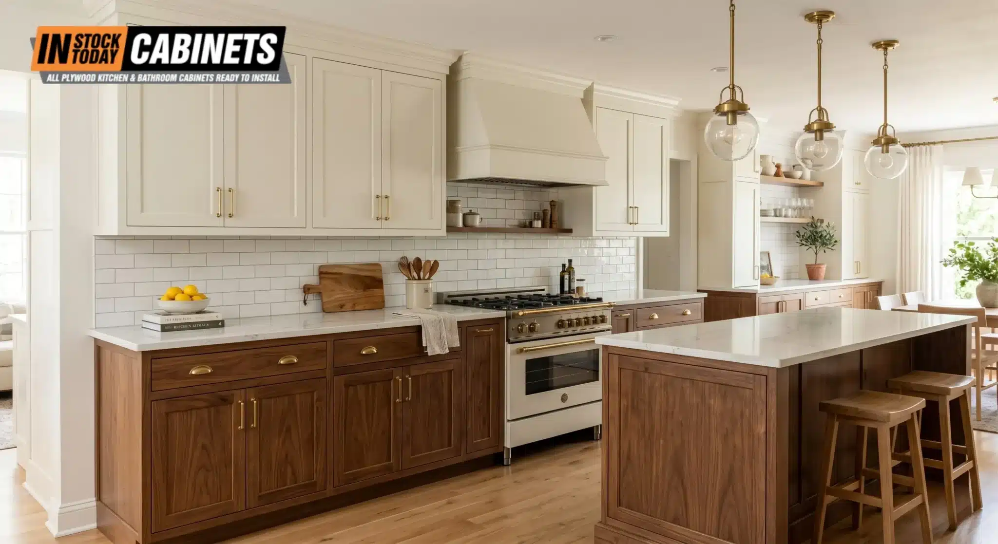
1. Warm white upper + medium-stained wood lower
The 2026 default in many designer surveys. Houzz’s data on wood overtaking white doesn’t mean white is leaving; it means white is moving upstairs. Pairing a warm-white upper (Sherwin-Williams Alabaster SW 7008 or Benjamin Moore White Dove OC-17) with a medium oak, walnut, or hickory lower keeps the kitchen feeling open while grounding it in natural texture.
Best for: transitional and modern-organic kitchens, open layouts, resale-conscious remodels.
Avoid if: your flooring has strongly cool gray undertones (creates an undertone clash).
Fabuwood pairings: Allure Imperio Nickel or Imperio Pearl above, with a Fabuwood Quest stained option below. The Fabuwood Illume series covers the warm-white-on-the-upper side cleanly.
2. Cream/khaki upper + smoky jade green lower
The 2026 darling per NKBA data. 86% of designers expect green to lead 2026 palettes, and the version holding up is a muted, dusty green with gray undertones, not a saturated emerald. Benjamin Moore Cushing Green HC-125, Sherwin-Williams Rosemary SW 6187, and Farrow & Ball Pigeon No. 25 are the references designers cite most. Pair with a warm cream or khaki upper (SW Accessible Beige SW 7036 or BM Manchester Tan HC-81) and you get a kitchen that reads sophisticated without trying too hard.
Best for: transitional and modern-organic kitchens, biophilic-leaning design, homes with natural wood floors.
Avoid if: you have bold blue or turquoise accents elsewhere. The green can fight cool blues at moderate saturation.
3. Greige upper + walnut lower
For homeowners who want color depth without color commitment. A greige upper (BM Revere Pewter HC-172 or SW Agreeable Gray SW 7029) paired with a walnut-stained lower cabinet line offers warmth and grounding without any saturated hue in the mix. This is one of the safer “future-proof” combinations. Greige acts as what designers call a “universal bridge tone” and tolerates almost any countertop, backsplash, or flooring choice.
Best for: transitional kitchens, resale-driven remodels, clients undecided on a hero color.
Avoid if: the room already feels gray-leaning (gray flooring + gray walls + greige cabinets reads flat).
4. White upper + deep indigo navy lower
The pairing that replaced the old white-and-black combo. Hale Navy HC-154 (Benjamin Moore) and Naval SW 6244 (Sherwin-Williams) are the two paint codes that come up in nearly every 2026 navy-kitchen feature. Keep the navy on the bottom so it grounds the room, then balance it with brass hardware and a warm wood floor. A pure white upper looks too clinical here. Go with an off-white like BM Simply White OC-117 to keep the room from feeling cold.
Best for: coastal homes, transitional kitchens, homes with strong natural light.
Avoid if: the kitchen is north-facing or low-light. Navy lowers in dim light read as black.
5. Espresso/dark wood upper + light maple or oak lower
The inverted classic. Most upper/lower splits put the dark on the bottom, but a few designers in 2026 are flipping it: a deep espresso or dark walnut upper with a pale natural maple or rift-cut oak lower. The effect is more dramatic and works best in kitchens with high ceilings, since the dark upper can compress a low-ceiling space.
Best for: kitchens with 9-foot or taller ceilings, contemporary designs, owners who plan to stay 10+ years.
Avoid if: ceilings are 8 feet or under, the room is small, or you’re optimizing for resale.
6. Wood perimeter + bold-color island
The island-as-accent layout. Perimeter cabinets in a medium oak or walnut, paired with an island painted in one of the 2026 hero colors: smoky jade, indigo navy, deep terracotta, or saturated forest green. Designers in 2026 trend reports recommend this layout most often for homeowners who want a statement without committing color across the entire room. It’s also the easiest two-tone layout to update later. Repainting one island is a weekend project. Repainting twelve perimeter cabinets is not.
Best for: open-plan kitchens, homes with prominent islands (7+ feet long), anyone hesitant about committing to color across the whole kitchen.
Avoid if: the island is small (under 5 feet). The accent color won’t have enough surface area to feel intentional.
7. Black upper + warm white lower (the high-contrast statement)
The most controversial pairing on the list. It’s rare in survey data but designers are using it on high-ceilinged kitchens with strong natural light. The black has to be the right black (Tricorn Black SW 6258 or BM Black HC-190, not a bluish off-black), and the white needs warmth (Simply White, not pure white). This version isn’t for resale kitchens. It’s for owners who plan to stay 10+ years.
Best for: statement contemporary kitchens, high ceilings, owners committed to staying long-term.
Avoid if: you’re staging to sell within 24 months, or the kitchen is north-facing.
2026 Two-Tone vs. 2018 Two-Tone
The trend itself didn’t change. The execution did. Here’s what shifted:
| Element | 2018 version | 2026 version |
|---|---|---|
| Color logic | High contrast (white + espresso, white + black) | Shared undertones (warm white + walnut, cream + jade) |
| Finish | High-gloss painted | Matte or satin painted, paired with stained wood |
| Upper-cabinet color | Bright white | Off-white, cream, warm white, or wood |
| Lower-cabinet color | Espresso, black, charcoal | Medium wood, deep green, navy, warm neutral |
| Island treatment | Same as lower cabinets | Bold accent color or contrasting wood species |
| Hardware | Mixed brushed nickel | Brass dominant, with matte black as a second metal |
| Backsplash | White subway tile | Slab quartz, zellige, or large-format tile |
If your existing kitchen falls in the 2018 column, the good news: most of it can be updated without a full gut. Repainting the upper cabinets to a warm off-white, refinishing the lower cabinets with a wood stain, and swapping the hardware can move the room into the 2026 column for a fraction of what new cabinets cost. The structure stays. The color story changes.
The 70/30 Rule (And Two Other Proportion Rules)
A 50/50 two-tone split creates visual competition rather than deliberate hierarchy, which is why even when both colors are relatively neutral, equal coverage often reads as muddy rather than layered. Designers consistently apply some version of these three proportion rules:
The 70/30 rule. One color dominates (70% of the cabinet square footage), and the other accents (30%). This prevents the kitchen from feeling visually split in half. In an upper/lower layout, the lower cabinets usually carry more square footage than the uppers, so they end up as the dominant tone by default. That’s why deep colors on the bottom work and the same colors on the top often don’t.
The two-thirds rule for upper/lower. If you’re going upper/lower, the lower cabinets should be the darker or more saturated tone two-thirds of the time. The remaining one-third (dark upper, light lower) requires a specific architectural setup: high ceilings, strong natural light, or a particularly tall homeowner. It’s not impossible, but it’s not the default.
The island-gets-the-vote rule. When in doubt, put the accent color on the island. The island is already a visual focal point, it’s surrounded by perimeter cabinets that frame it, and it’s the easiest piece of the kitchen to update later. Designers in 2026 are using the island as the “color experiment zone,” the place where homeowners try the bold choice without committing the entire room.
These rules aren’t laws. But you’ll notice the kitchens that don’t follow them are the ones that read busy.
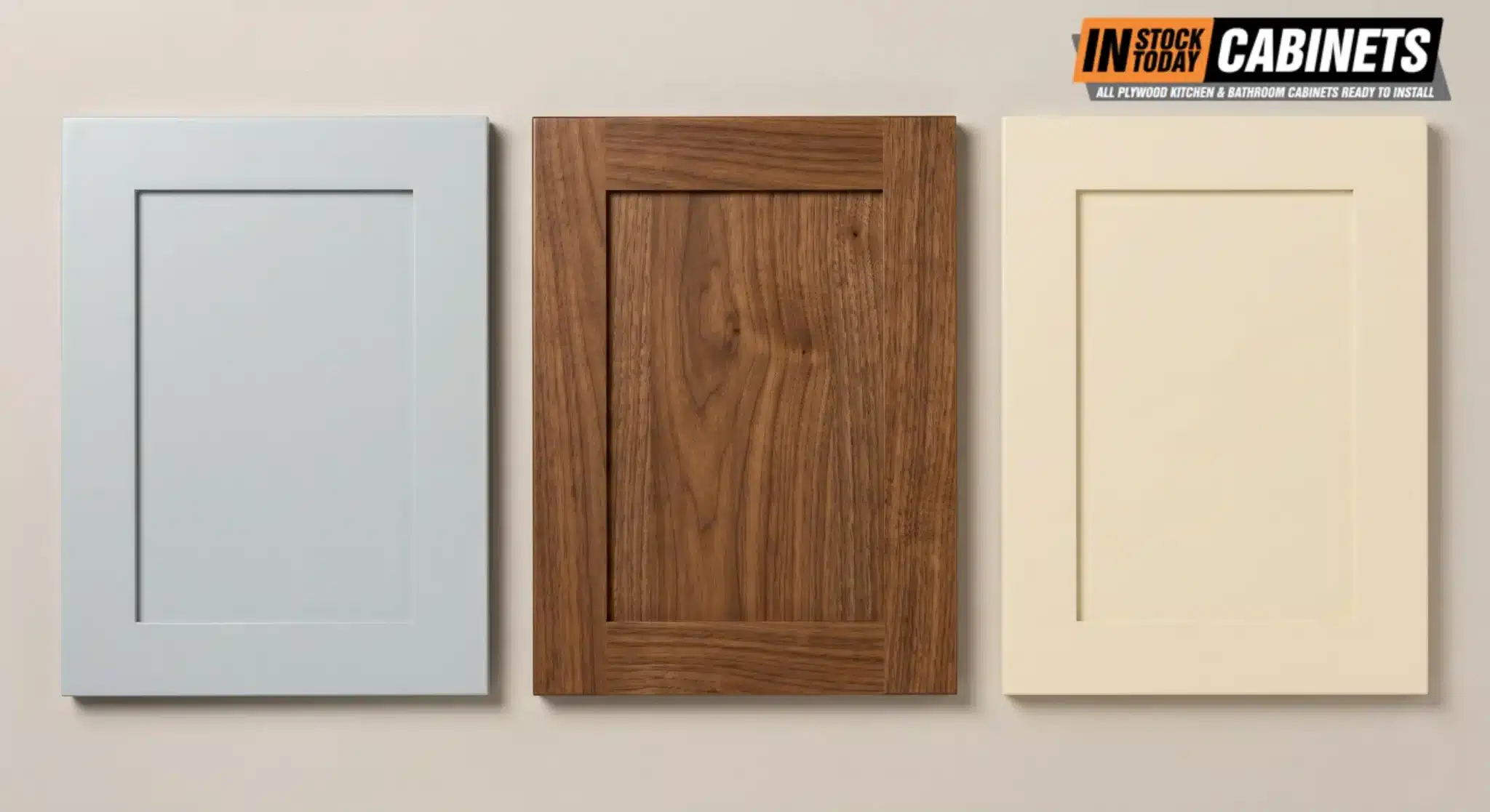
Undertone Discipline: The Single Biggest Make-or-Break Factor
Color names are mostly irrelevant. Undertones are everything. A “navy” with cool blue-gray undertones paired with a “cream” with warm yellow undertones will clash even if the contrast seems stylistically appropriate. Every neutral has a hidden hue, and that hidden hue determines whether two cabinet tones harmonize or fight each other.
The designer rule, stated consistently across 2026 trend reports, is straightforward:
- Warm + warm: cream uppers with warm walnut lowers
- Cool + cool: crisp white uppers with steel-blue lowers
- Taupe/greige + almost anything: greige acts as a universal bridge tone
- Strong contrast only when intentional: white plus pure black in a tuxedo kitchen
The practical test: always evaluate paint or finish samples in both morning natural light and evening artificial light before committing. Cabinet colors shift between light sources, and a combination that looks harmonious in a showroom under halogen may appear discordant under warm LED lighting at home.
“Most two-tone mistakes happen before cabinets are ordered. Homeowners pick paint and wood separately, then discover the undertones fight each other in real light. We always tell clients to bring their flooring sample and countertop sample to the showroom and lay everything out together under the same light. Five minutes of doing that saves three weeks of regret.”
IST Cabinets showroom team, Fairfax, VA
This is why the in-person test matters. A paint chip held next to a wood door under fluorescent showroom lighting will look different than the same combination in your kitchen at 6 p.m. on a cloudy day. The closer your sample evaluation gets to your real conditions, the lower the risk of post-install regret.
Hardware: The Quiet Bridge Between Two Tones
Hardware is the bridge that ties two-tone cabinets together. Get it wrong and the kitchen reads like two separate rooms taped together. The 2026 Houzz data shows bar pulls now dominate over knobs across all cabinet styles, and brushed nickel, matte black, and brushed gold are the three finishes designers reach for most.
A few rules of thumb the working designers we talk to apply:
For a warm two-tone palette (cream + walnut, white + sage), brass or brushed gold reads cohesive. The warm metal echoes the wood and softens the painted cabinets.
For a cool two-tone palette (white + navy, greige + charcoal), matte black or brushed nickel feels right. Brass can work but tends to fight the cooler tones unless the rest of the kitchen leans warm (wood floor, warm lighting).
The “third metal” technique. Some 2026 kitchens use one hardware finish on the perimeter and a second on the island. This works only if the third metal, usually the faucet, bridges them. A brass faucet ties brass perimeter pulls to matte black island pulls, for example. Done well it adds depth. Done carelessly it looks like the budget ran out halfway through.
A note on hardware sizing: bar pulls 5–7 inches long pair best with the slim Shaker and flat-panel door styles dominating 2026. Oversized 10+ inch pulls work on flat-panel slabs but can overwhelm a Shaker. The cabinet door style you choose constrains the hardware decision more than most homeowners realize.
Lighting Considerations for Two-Tone Kitchens
Lighting in 2026 is treated as a layered system, not a single fixture. The interaction between light temperature and multi-tone finishes is one of the most common points of failure in two-tone kitchens. A navy lower cabinet can read black under cool overhead light, and an olive green can read muddy brown under low-CRI bulbs.
A few guidelines that come up consistently in 2026 trend reports:
| Light layer | Recommended Kelvin | What it does |
|---|---|---|
| Ambient (ceiling) | 2700K to 3000K | Overall room glow; enhances red and brown tones in wood |
| Task (under-cabinet) | 3500K to 4000K | Food prep visibility; keeps whites crisp and greens fresh |
| Accent (in-cabinet) | 3000K | Highlights glass-front displays; warm-neutral balance |
| Night (toe-kick) | 2200K to 2700K | Low-glare safety lighting that doesn’t disrupt sleep cycles |
For kitchens featuring bold colors (forest green, navy, burgundy, espresso), specify lighting with a Color Rendering Index (CRI) of 90 or higher. Lower-CRI lighting causes complex hues to lose depth, which is what’s actually happening when a navy cabinet looks black or an olive green looks brown indoors.
North-facing kitchens, which receive cooler and dimmer natural light, benefit from warmer white cabinetry (off-white rather than pure white) to prevent the space from feeling clinical.
Mistakes That Date a Two-Tone Kitchen
A few execution choices age a two-tone kitchen faster than the colors themselves. The list below is what designers tell clients to watch for:
Maximum contrast. Pure white uppers with pure black lowers. Pure white with espresso. These were the dominant 2018 combinations, and they aged hard. The 2026 equivalents soften the contrast (warm white with walnut, off-white with charcoal) and read more current.
Mismatched undertones. Covered in detail above. The single most common cause of “something is off about this kitchen” complaints. Cool whites paired with warm woods, warm whites paired with cool grays, or any pair where the hidden hues fight each other.
Color matching the appliances. A stainless-steel-only kitchen with bright white uppers can work. A matte-black-appliance kitchen with bright white uppers usually doesn’t work. The appliances start to dominate. In an appliance-forward kitchen, the cabinets should soften, not compete.
Two trendy colors at once. Pick one color to lead and one to support. A sage upper plus a terracotta lower is two main characters in the same scene. The result feels like a mood board, not a kitchen. The 2026 rule of thumb: one color, one neutral, one wood.
Over-bolding the island. A jewel-tone island in a small kitchen often does more harm than good. The island ends up dominating sightlines and shrinking the room. In kitchens under 150 square feet, designers usually recommend a softer accent: a deep neutral, a wood tone, or a muted color rather than a saturated one.
Glossy finishes on lower cabinets. High-gloss lacquer was the 2018 hallmark and now reads instantly dated. 2026’s preferred finish is matte or satin. Houzz reports more homeowners now prefer surfaces that reduce glare and hide everyday wear, and matte does both. Modern anti-fingerprint matte lacquers have largely solved the old issue of showing every smudge.
Adding a third cabinet color. Once a third color enters the cabinet palette, the kitchen reads chaotic. Two-tone means two tones. A third hue belongs on the walls, the backsplash, or the floor, not the cabinets.
Two-Tone Pairings with Fabuwood
IST stocks Fabuwood, which gives most clients a wide pairing matrix without leaving one product family. A few combinations work especially well:
Allure Imperio Pearl (upper) + Quest Honey Glaze (lower). Warm white above, medium-stained wood below. Reads classic-transitional. Works in almost any home style. Stocked across most IST showrooms.
Allure Galaxy Frost (upper) + Allure Galaxy Espresso (lower). Both inside the Galaxy line, both Allure, but two distinct finishes. Cleaner option than mixing across series because the door profiles match perfectly. The Galaxy Frost reads as a soft warm white; Galaxy Espresso adds the deep grounding tone.
Quest perimeter + Allure Galaxy Indigo island. Wood perimeter with a saturated navy island. Costs slightly more because you’re combining series, but it’s the version that photographs best in marketing material and the one designers in the Alexandria showroom recommend for clients who want a statement island.
The Fabuwood Galaxy line is particularly well-suited to two-tone work because the Galaxy door style stays consistent across colors. When the door profile changes between upper and lower cabinets, the kitchen reads as two different cabinet runs rather than one intentional design. If you’re evaluating Fabuwood for your renovation, the consistency of the Galaxy and Allure profiles is one of the reasons it works cleanly for two-tone layouts.
For homeowners pairing wood lowers with painted uppers, the Fabuwood wood finish library maps onto the most common 2026 pairings. Honey, mocha, espresso, and the new gray-toned stains all show up in Quest and select Allure lines.
Not sure which Fabuwood finishes work together?
Pick the two tones you’re considering, then bring your flooring sample and countertop sample to an IST showroom. Lay everything out side by side under the same light. It’s the only way to know whether the warm white you picked on a paint chip actually pairs with the wood you’re considering for the lower cabinets.
When Not to Go Two-Tone
A few situations where single-tone wins, despite the trend data:
Galley kitchens under 8 feet wide. A two-tone split in a narrow galley can feel like the walls are closing in. The visual break between tones makes the room feel chopped. Most galley kitchens read better in a single, slightly bold tone: a medium wood, a soft sage, or a warm off-white.
Open-plan kitchens that flow into a great room. If your kitchen sightline includes a living area in the same room, the two-tone split can fight the living-room palette. Designers usually recommend either matching the cabinet tone to the room’s dominant color (single tone) or keeping the kitchen accent very subtle (island-only split, no upper/lower contrast).
Small ceilings under 8 feet. The compressing effect of a dark upper or aggressive contrast is amplified at lower ceiling heights. A single, light-to-medium tone keeps the room feeling taller.
Kitchens you’re staging to sell within 12 months. Real estate agents in the Northern Virginia and Maryland markets consistently recommend single-tone neutral palettes for active listings. Two-tone reads as a design choice, and design choices polarize buyers. If you’re staying long term, two-tone is a great choice. If you’re selling next spring, single tone is a safer bet.
Does Two-Tone Cost More?
Yes, modestly. There are three reasons.
First, you’re ordering two finish runs instead of one, which means two separate paint or stain batches and slightly more setup time at the manufacturer. On a typical IST Fabuwood order, the upcharge runs roughly 5–10% over a single-tone cabinet order of the same size.
Second, lead times can be a few days longer if the two finishes ship from different production lines. This matters most for stock kitchens. A homeowner replacing an existing kitchen on a tight timeline should ask the showroom about availability before locking in a two-tone plan.
Third, the hardware and finish coordination usually requires more time at the design stage. Designers report spending 1–2 extra hours per project on two-tone selections compared to single-tone, mostly because the undertone matching takes longer.
None of these are deal-breakers. They’re worth knowing before you start so you can budget time and money accordingly. For most IST clients, the 5–10% upcharge is a small fraction of the total kitchen cost, typically $1,000 to $2,000 on a $20,000 cabinet order.
If a full new-cabinet order isn’t in the budget, repainting existing cabinets in a two-tone scheme is the lowest-cost route. According to Angi data, painting all kitchen cabinets typically costs between $425 and $1,461 nationally, with an average of around $935. A half-and-half two-tone paint job is only marginally more expensive than single-tone repainting, since labor is similar whether painting one color or two.
Frequently Asked Questions
What percentage of 2026 kitchens are two-tone?
Nearly 1 in 4. The 2026 U.S. Houzz Kitchen Trends Study (n=1,780 renovating homeowners) found that close to a quarter of renovators now choose contrasting upper and lower cabinets, and the share has climbed across the last three Houzz reports. The trend concentrates among homeowners ages 30 to 55 doing major renovations rather than cosmetic refreshes.
What’s the most popular two-tone combination right now?
Warm white or off-white uppers over medium-stained wood lowers. In the Houzz contrasting-cabinet data, white leads upper-cabinet colors at 40%, followed by off-white at 19% and wood tones at 17%, while lower cabinets skew toward wood, green, blue, and deep neutrals. Manufacturers are pushing bolder: at KBIS 2026, Black + Light Wood was the single most displayed pairing on the show floor at 18.80% of two-tone combinations.
Should the darker color go on top or bottom?
Bottom. Roughly two-thirds of well-executed two-tone kitchens put the darker or more saturated tone on the lower cabinets, where it grounds the room while the lighter upper draws the eye toward the ceiling. The inverse layout, dark upper over light lower, only works with tall ceilings and strong natural light. Under a standard 8-foot ceiling, dark uppers compress the space.
Does two-tone make a small kitchen look smaller?
Not if the contrast stays soft. A light upper over a slightly darker lower can make a small kitchen feel taller, since the eye travels up toward the lighter tone. The real trap is saturated or high-contrast lower cabinets in a tight room; those do shrink it visually. For galley kitchens or rooms under 150 square feet, gentle pairings like warm white + greige or off-white + light wood beat hard contrast.
What hardware finish works with two-tone cabinets?
Match the metal to the palette’s temperature. Warm palettes (cream, sage, walnut) read cohesive with brass or brushed gold; cooler palettes (white, navy, charcoal) pair better with matte black or brushed nickel. The 2026 Houzz data shows bar pulls dominating over knobs, with brushed nickel leading, then matte black and brushed gold. Size matters too: 5 to 7 inch pulls suit the slim Shaker and flat-panel doors leading 2026.
Can I mix stained wood with painted cabinets?
Yes. It’s the two-tone strategy designers recommend most right now: a painted upper in warm white, cream, or sage over a lower run in stained wood like medium oak, walnut, or hickory. The one rule is undertone matching. Warm wood needs a warm white above it; cool-toned wood needs a cooler white. Get that wrong and the pairing fights itself in real light.
How long do two-tone trends actually last?
The concept has lasted decades; specific pairings age at different speeds. Warm white + walnut, cream + muted green, and greige + wood sit in neutral territory and are the safest bets to still feel current 10 years out. Bolder combinations, like a jewel-tone island or navy with black, photograph well today but carry more dating risk. Pick by how long you plan to live with the kitchen.
What’s the cost difference between single-tone and two-tone cabinets?
About 5 to 10% more on a typical Fabuwood order, so roughly $1,000 to $2,000 on a $20,000 cabinet job, depending on the finishes. Installation labor is the same; both layouts install identically. If new cabinets aren’t in the budget, repainting is far cheaper: Angi puts the national average for painting a full kitchen at around $935, and a two-tone paint scheme costs only marginally more than single-tone since the labor is similar.
Should I match my appliances to the cabinets?
Generally no. Treat appliances as a third element, separate from the two cabinet tones. Stainless steel reads neutral against almost any combination, while matte black appliances work best with warm cabinet palettes. Panel-ready appliances, where the front matches the cabinetry, should match the dominant cabinet color, never the accent.
What lighting works best for two-tone kitchens with bold colors?
LED bulbs with a Color Rendering Index (CRI) of 90 or higher across every light layer. Lower-CRI lighting is why navy cabinets read black, olive greens turn muddy brown, and burgundy goes gray indoors. For color temperature, the layered system most 2026 trend reports recommend runs 2700–3000K for ambient light, 3500–4000K for under-cabinet task light, and 2200–2700K for toe-kick night lighting.
Where can I see two-tone Fabuwood options in person?
IST Cabinets displays two-tone Fabuwood layouts at showrooms in Fairfax, VA, Alexandria, VA, Columbia, MD, Houston, TX, Roselle, IL, and Delaware. Display kitchens rotate seasonally to track current trend data, so you can compare finishes side by side under the same light. Bring your flooring and countertop samples.
Plan Your Two-Tone Kitchen with IST Cabinets
Two-tone done well is one of the few kitchen design decisions that adds character without aging the room. Done poorly, it becomes the thing future buyers remember about your kitchen. The difference is in the details: undertone matching, proportion, hardware bridges, and picking a pairing the design world hasn’t already moved past.
IST stocks Fabuwood across six showrooms and works with builders, contractors, and homeowners planning kitchen renovations across Virginia, Maryland, Delaware, Texas, and Illinois. If you’re at the planning stage, a 30-minute showroom visit lets you see the actual finishes side by side. That’s the only way to know whether the warm white you picked on a paint chip actually pairs with the wood you’re considering for the lower cabinets.
Book a design consultation or download the free pricing and specifications catalog to start planning.
Visit an IST showroom: